Crafting a new look for premium homebuilder
The Brief
Cala homes came to us at a pivotal moment in their near-150 year history: the start of a five year plan aimed at reshaping the brand and their offering to appeal to a new generation of homebuyers.
The brand had always been known for their exceptional quality, but now they wanted to communicate more: a more accessible brand with a commitment to building sustainable, beautiful homes, and strong communities. They tasked us with refreshing their visual identity to reflect this new positioning.
The Work
An intensive, collaborative process led to a solution that respected the history and authority of the Cala brand, the equity in their legacy identity, and their unwavering commitment to craft. But which also signalled a fresher, more accessible, more current Cala.
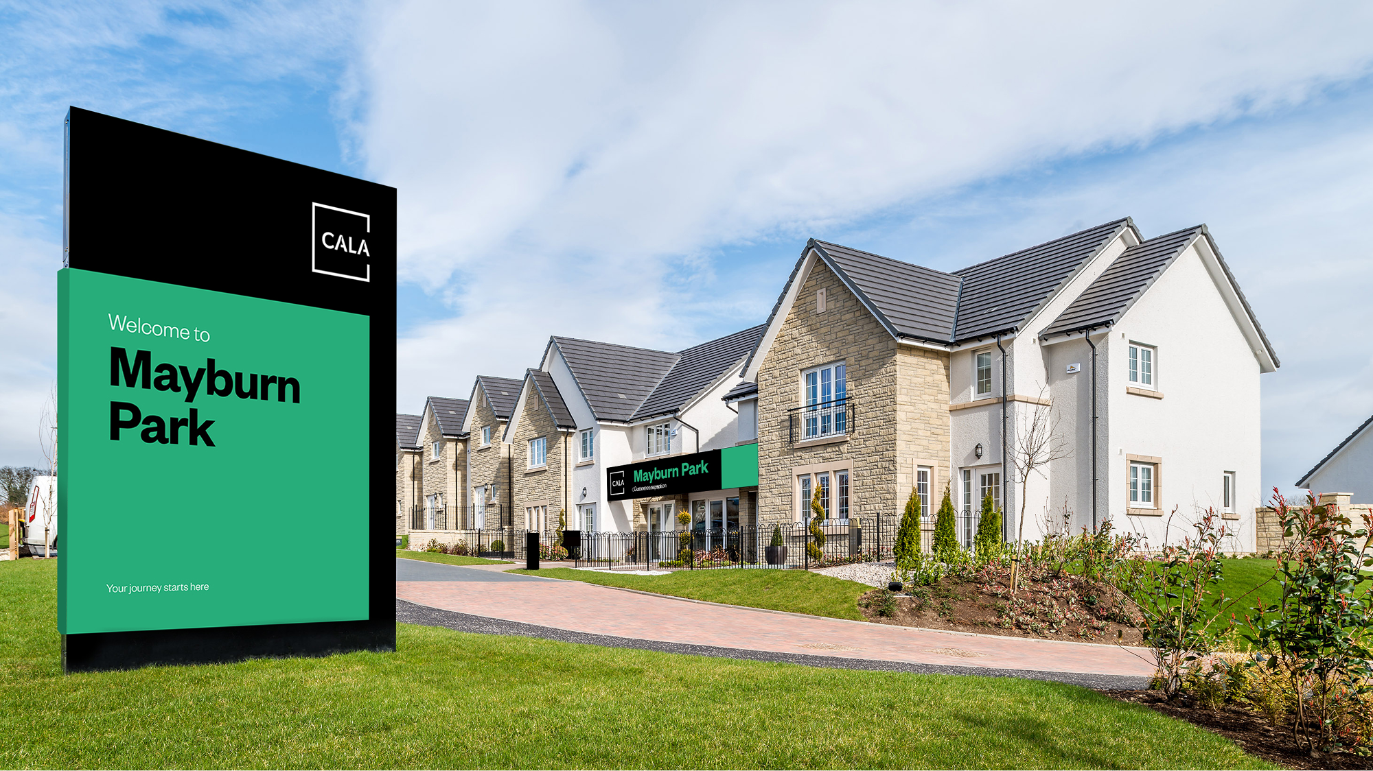
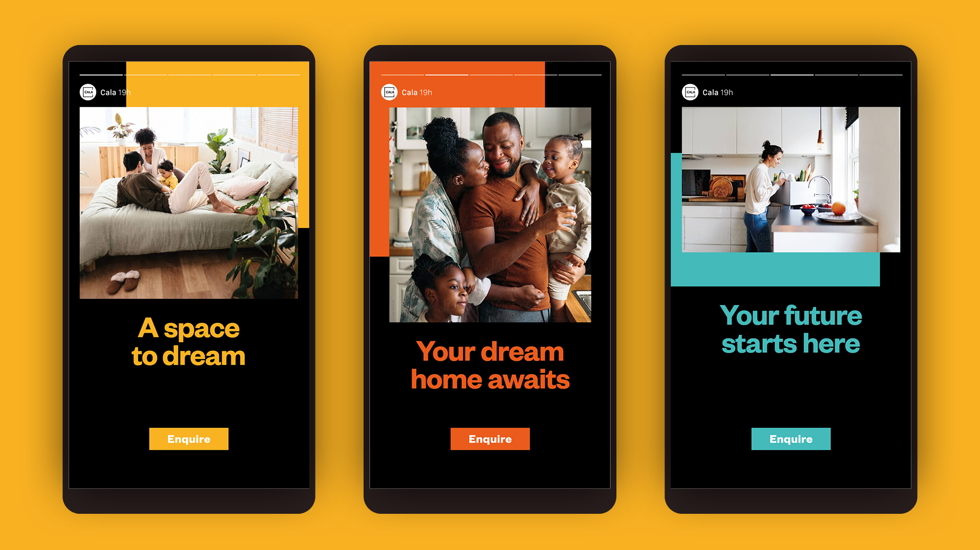
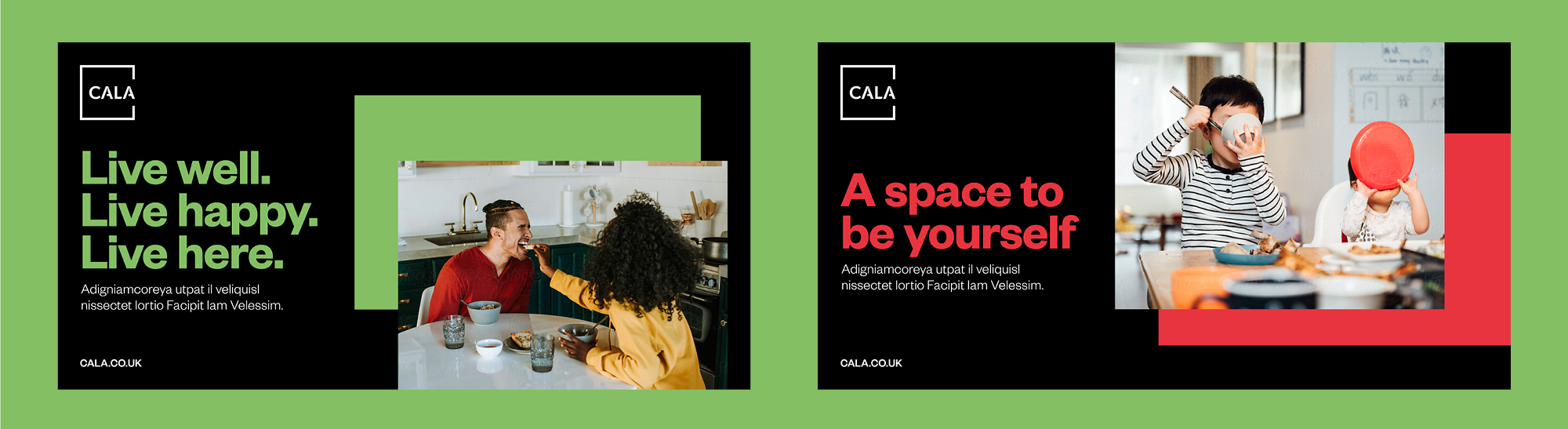
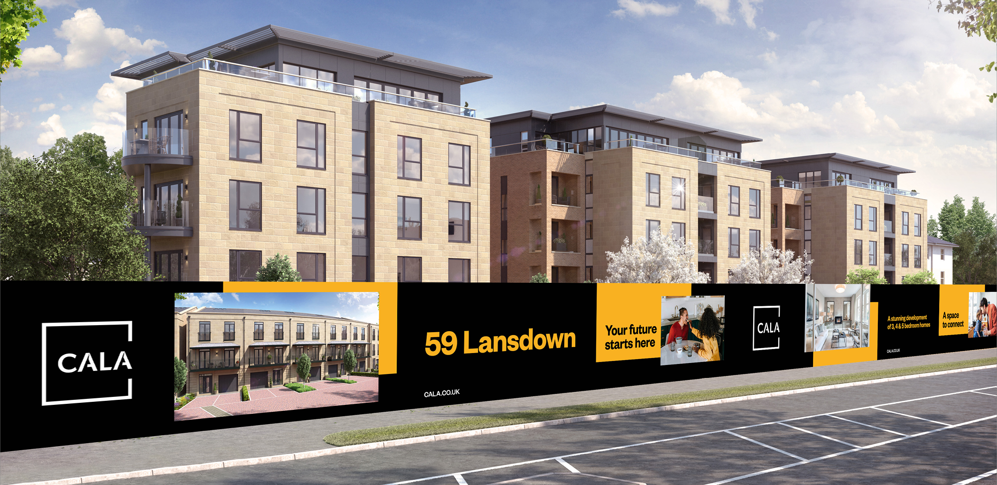
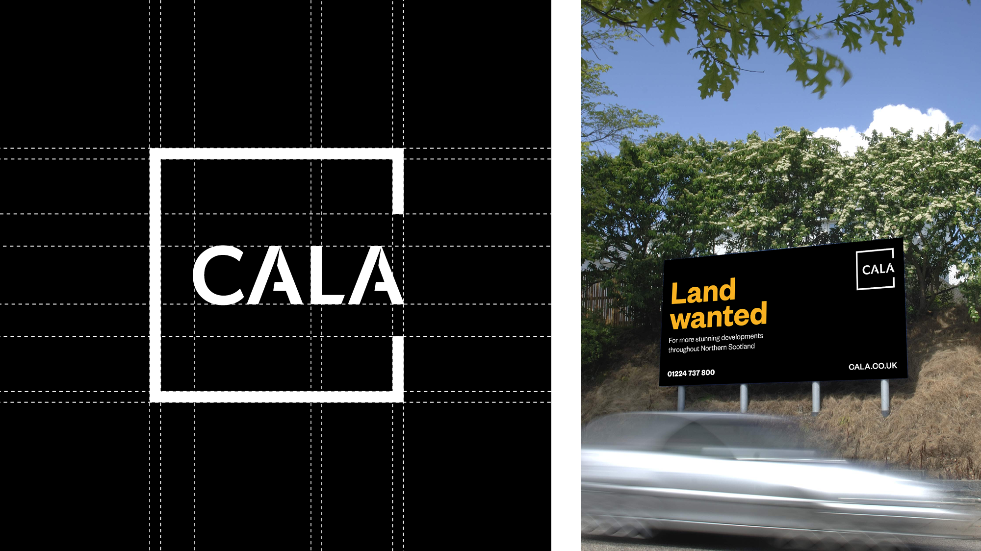
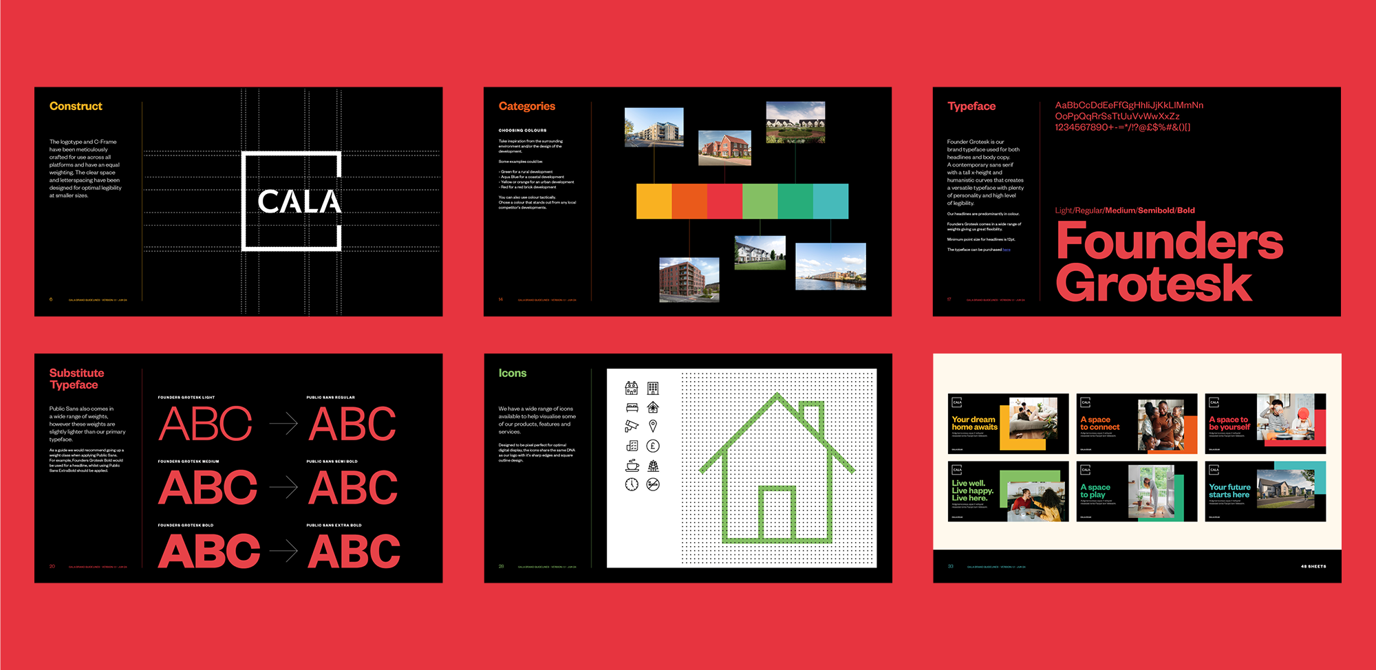
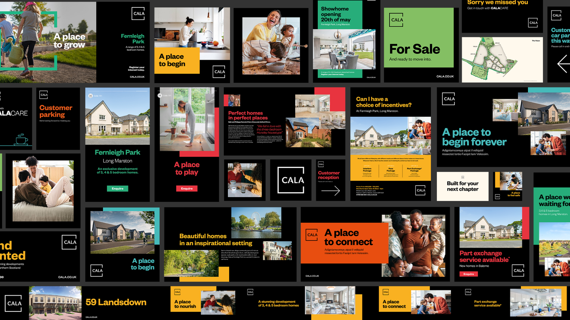
A streamlined square logo represented both an open-door floor-plan, and a graphic C, while detailing in the wordmark hinted at timber-frame construction. Black and white remained at the core of the visual identity, but a secondary palette of bold colours added flexibility and an optimistic, approachable feel.
More work

Branding the biggest game in football
UEFA CHAMPIONS LEAGUE FINAL 2024