TOPPSERIEN
Moving Norwegian women’s football forward
The Brief
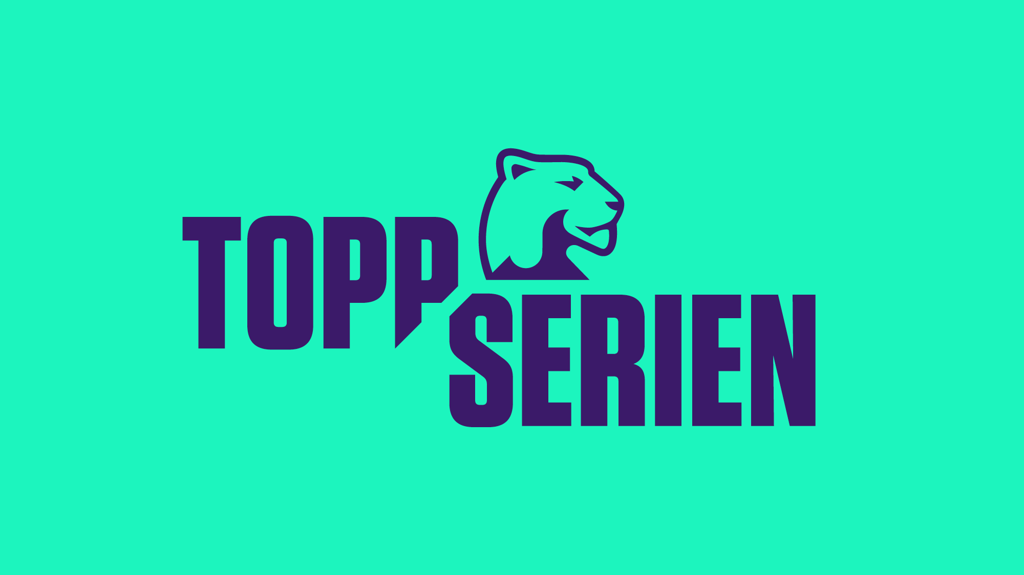
Toppserien, the top league in women's football in Norway, approached us with a request for a rebrand. They wanted to move on from using the men’s logo (a lion) without creating a different brand altogether. In short, they wanted an evolution not a revolution.
The Work
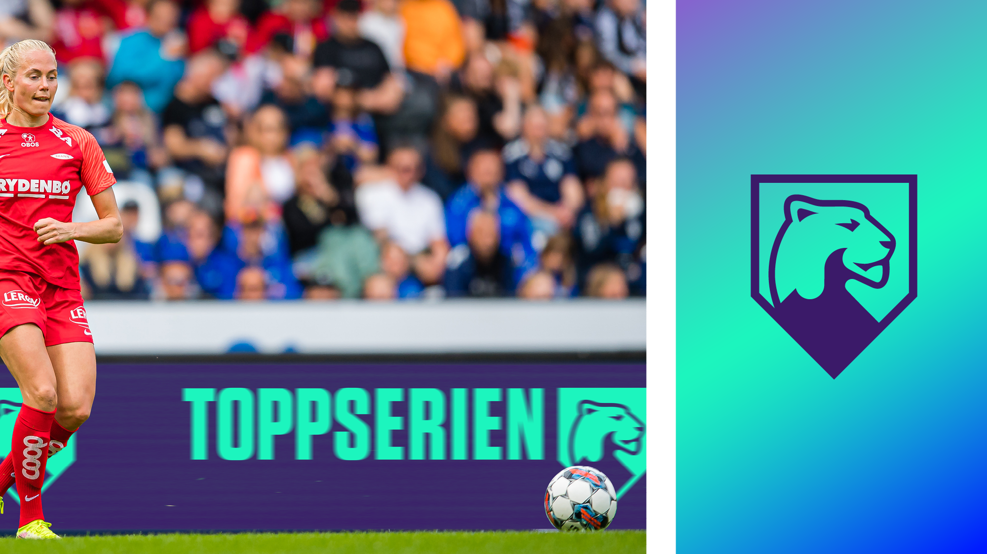
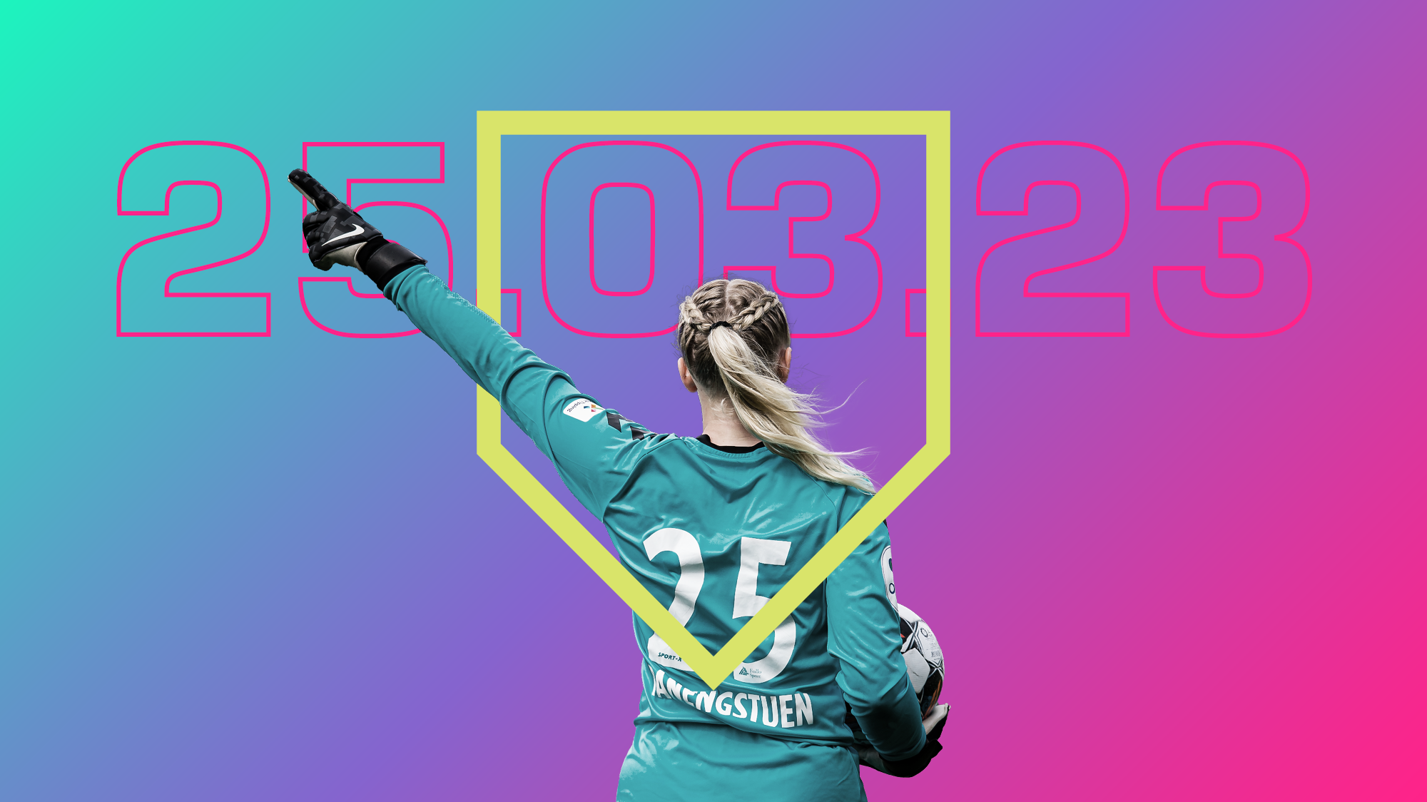
Instead of a complete overhaul, we transformed the men’s lion into a commanding lioness and altered the direction it was facing to show that Toppserien are a forward-looking league. Along with the bold, bright refresh of their visual identity, the new look gave Norway’s top women’s football league a look fit for purpose and ready to appeal to a new generation of supporters.
The Results
More work
View Symbolising unity in Welsh football work
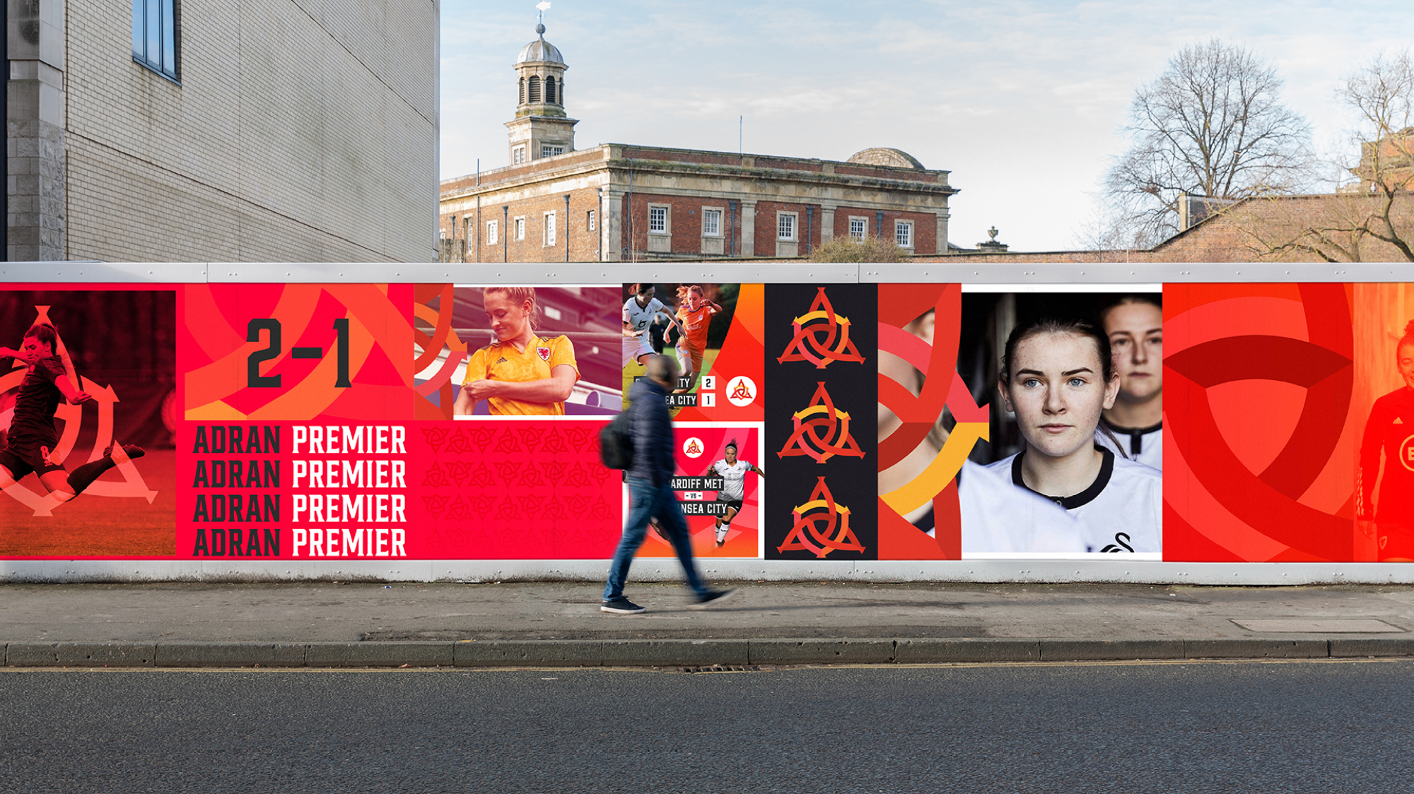

Symbolising unity in Welsh football
FOOTBALL ASSOCIATION OF WALES
